📘 Frontend/Vue
Vue - 학습 기록 앱 만들기 3 : Base Button Component
신건우
2023. 8. 5. 16:45
Base Button Components
학습 기록 앱에 쓰일 기본 버튼 Component를 추가해보겠습니다.
props중 type 프로퍼티는,
버튼의 타입을 받아서 타입마다 다른 CSS를 적용할 수 있게 Style을 해두었습니다. (ex: 마우스를 올릴 시 다른 CSS 적용)
mode 프로퍼티는 CSS의 Class 명을 받아서 mode에 바인딩 해줍니다.
그리고, 버튼에 들어갈 컨텐츠는 당연히 외부에서 받아야 하므로 slot으로 받습니다.
BaseButton.vue
<template>
  <button :type="type" :class="mode">
    <slot></slot>
  </button>
</template>

<script>
export default {
  props: ['type', 'mode']
}
</script>

<style scoped>
button {
  padding: 0.75rem 1.5rem;
  font-family: inherit;
  background-color: #3a0061;
  border: 1px solid #3a0061;
  color: white;
  cursor: pointer;
}

button:hover,
button:active {
  background-color: #270041;
  border-color: #270041;
}

.flat {
  background-color: transparent;
  color: #3a0061;
  border: none;
}

.flat:hover,
.flat:active {
  background-color: #edd2ff;
}
</style>
그리고, 이 기본 버튼도 다른 컴포넌트들에서 계속 사용할 것이기 떄문에 전역 컴포넌트로 등록해줍니다.
main.js
import { createApp } from 'vue';

import App from './App.vue';
import BaseCard from './components/UI/BaseCard.vue';
import BaseButton from "@/components/UI/BaseButton";

const app = createApp(App)

app.component('base-card', BaseCard);
app.component('base-button', BaseButton);

app.mount('#app');
그리고 기존 LearningResource 컴포넌트에서도 버튼을 사용하고 있으니, 여기서도 BaseButton 태그로 변경해줍니다.
LearningResource.vue
<template>
<li>
<base-card>
<header>
<h3>{{ title }}</h3>
<base-button>Delete</base-button>
</header>
<p>{{ description }}</p>
<nav>
<a :href="link">View Resource</a>
</nav>
</base-card>
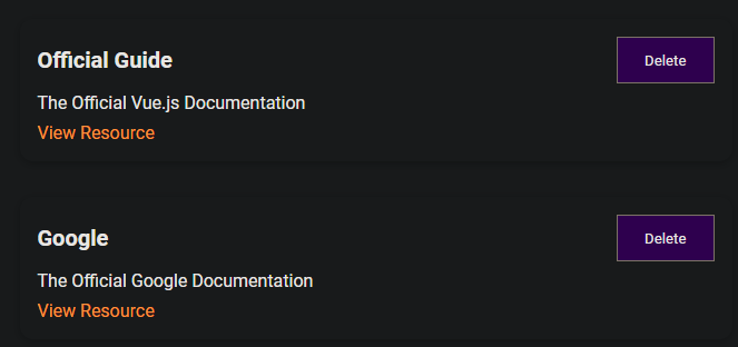
</li>
</template>이제 버튼의 UI가 변경되었습니다.
버튼의 테두리가 마음에 안든다면 base-button을 호출하는 속성으로 mode="flat"을 주면 해결됩니다.